Authored By Melissa Smith | Senior, Advisory & Transformation Services
Large companies are frequently using data to improve business efficiency and reduce expenses. Even smaller companies are using data to improve interactions with their customers and predict business outcomes. At a time when costs are rising, margins are becoming thinner, and the workforce is changing, companies that have insights into their profits, costs, and financial cycles are better prepared to make smarter decisions. While newer ERPs may include some analytics reporting capabilities, older ERPs such as SeaSoft haven’t caught up. However, companies can still find the answers they’re looking for. A recent customer came to us with exactly this problem, and we were able to build a fully automated solution with modern reporting capabilities in less than 60 days.
This customer had been performing manual weekly refreshes of the data from SeaSoft into five different Excel workbooks. The data was then manually aggregated and joined together to produce a large table of data from which reporting pivot tables were built. The process took team members nearly six hours per week to complete and because of the manual nature, was prone to errors.
SC&H was able to extract the query definitions and business logic from the Excel workbooks, document everything and rebuild the logic in Power BI. And, because SeaSoft offers connectivity to its backend data via ODBC connectors, we were able to pull the data directly from SeaSoft into Power BI and completely automate the process.
Loading Data and Translating Business Logic
It is not unusual for business processes to be neglected as long as the results remain consistent and accurate. Consequently, processes often become tangled messes that one person understands or worse, only understands enough to make it work. Investing employee time into replacing something that already works is rarely a priority. But for the employee responsible to make it work, this becomes a stressor and headache on top of other daily tasks and contributes to falling job satisfaction. Our team was able to replace this client’s old data import process and give that employee his time back.
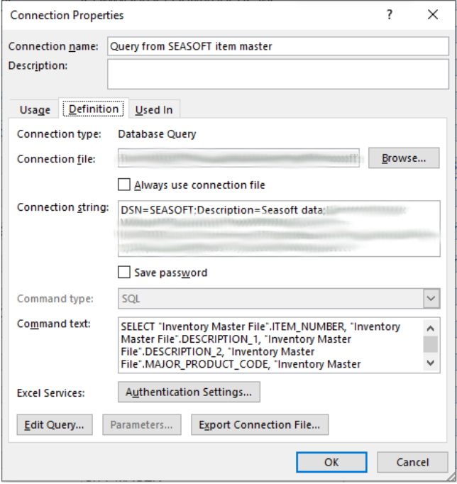
We started by extracting query information from the client’s Excel workbooks. Each query provided us with a Data Source Name to use and a list of fields from a SeaSoft table.
In the end, we pulled data from nine SeaSoft tables and two different SeaSoft databases:
- Invoice Archive Line Items
- Invoice Archive Order Info
- Invoice Archive Header
- Customer Expense Allocation
- GL Transactions
- Customer Master File
- Salesperson Master
- Broker Master File
- Inventory Master File
Working on a machine that could connect to SeaSoft via a System DSN, we were able to use Power BI’s ODBC connector to connect to each of these tables and load 4 years of data – millions of rows. Power Query’s many transformation functions allowed us to stage the data by creating calculated columns, merging tables and appending tables where necessary, and in one case, even adding sequence numbers over a partition. We joined the three invoice tables together to pull Customer, Item, Shipping information, Invoice Quantity, and Invoice Weight and join it to GL Transactions. We joined Customer Expense Allocation to GL Transactions as well. With GL Transactions holding the bulk of the financial data, we were able to create additional calculated columns such as Margin $, Margin %, Standard Freight Cost, Surcharge Freight Cost, Unit Cost, Unit Price, Margin per Pound, Production Cost per Pound, and many more.
While all transactional data is being pulled directly from SeaSoft, the customer also had some proprietary reference data and forecast data that was not in SeaSoft. This data is now staged in Excel workbooks on Sharepoint so that any updates will be refreshed and incorporated into Power BI as well.
Lastly, we installed a Power BI Gateway on this machine. The gateway provides the Power BI Service a way to access data situated in an on-premises network. Thus, the Power BI report can perform weekly scheduled data refreshes from the Power BI Workspace.
Building Custom, Useful, High-Quality Reports
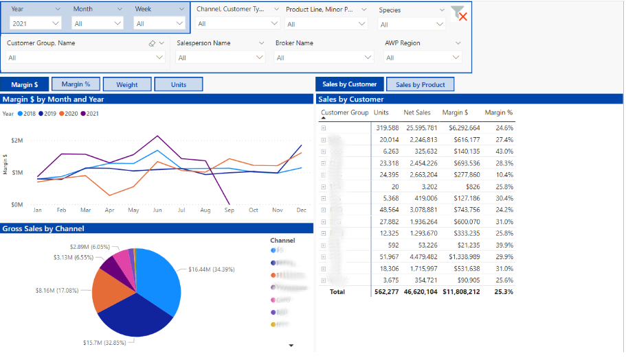
Once the data model was built out and validated, we were ready to begin building reports for the customer. We collected input from the CEO, the Director of Sales, and the business analyst to learn how they look at data and what measures and dimensions would be most useful for them. We created an ecosystem of trending charts by week, quarter, and month showing different measures as well as expandable tables of data and interactive tooltips of trending data. All reports can be filtered using any combination of the 13 included filters.
Choose Your Own Measure
Organizations are made up of people with many different roles. Each of these roles might look at data a little differently. The VP may want to see trending Gross Profits while a BDM is interested in viewing data by weight sold and a salesperson needs to know how many units they’ve sold. To provide all users with the most useful data for them, we added a selection tool for choosing the measure that is most relevant for you. Now a user can view data either by Units, Weight, Net Sales, etc. This list can be easily extended to include any measure available in the data.
Custom Reporting Calendar
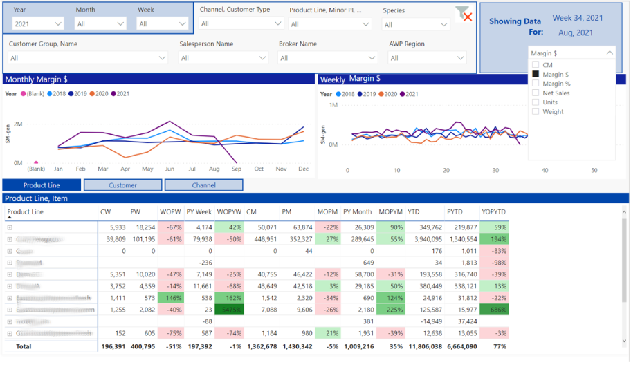
As these reports are all custom, we were able to incorporate and match the client’s business needs. Like many companies, the customer has their own reporting calendar. So, all reporting is done based on their reporting calendar, not the standard calendar.
Trailing Twelve Month Chart
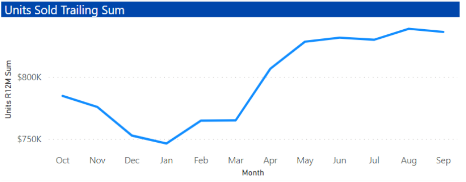
Many businesses find that their business is seasonal with high and low points occurring at various times every year. Due to this, trending graphs can lose some of their relevance since the trend will never be always increasing. Looking at year over year is helpful but an even better solution might be an analytical aggregation like Trailing Twelve Month or TTM Chart.
This chart always showcases the sum of the most recent 12 months. With that being said, the change from one point to the next indicates the net increase or decrease of the month added versus the month deleted. The big jump from March to April is showing us that when we removed April 2020 and added April 2021, we had a big net increase. Similarly, the decline from November to December indicates that deleting December 2019 and adding in December 2020 caused a net decrease in our running sum.
Prioritizing modern reporting can turn into a seamless process through the utilization of a fully automated solution. Give your company the advantage it deserves with easily accessible insights into your profits, costs, and financial cycles to better equip yourself to make smart decisions. If you have any questions or would like further detail on the information above, please reach out to our Advisory & Transformation team, or check out our page for a full overview of our services.

